Client
Blok Biltong
Industry
CPG
Services
Blok Biltong
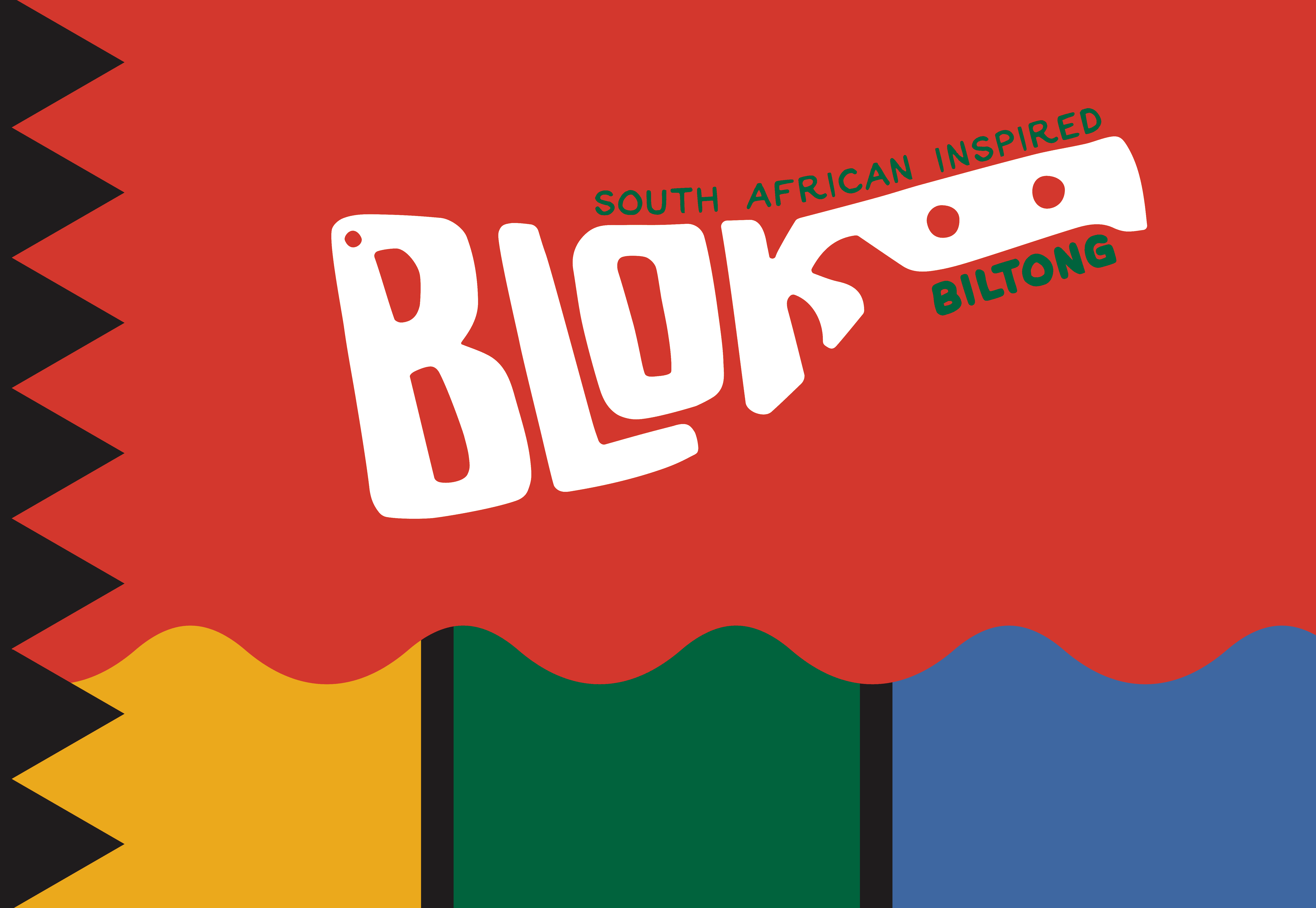
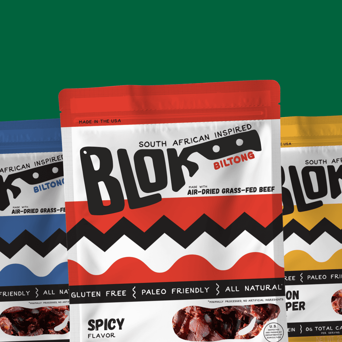
Blok Biltong, a traditionally South African cured-meat snack, was expanding to a US market and needed to better define what it was. The original brand and packaging featured artwork from the snack's hometown, but it…
The brief: take a dated design for a niche market and prepare it for wider distribution – signaling that biltong wasn't just another gas station beef jerky.
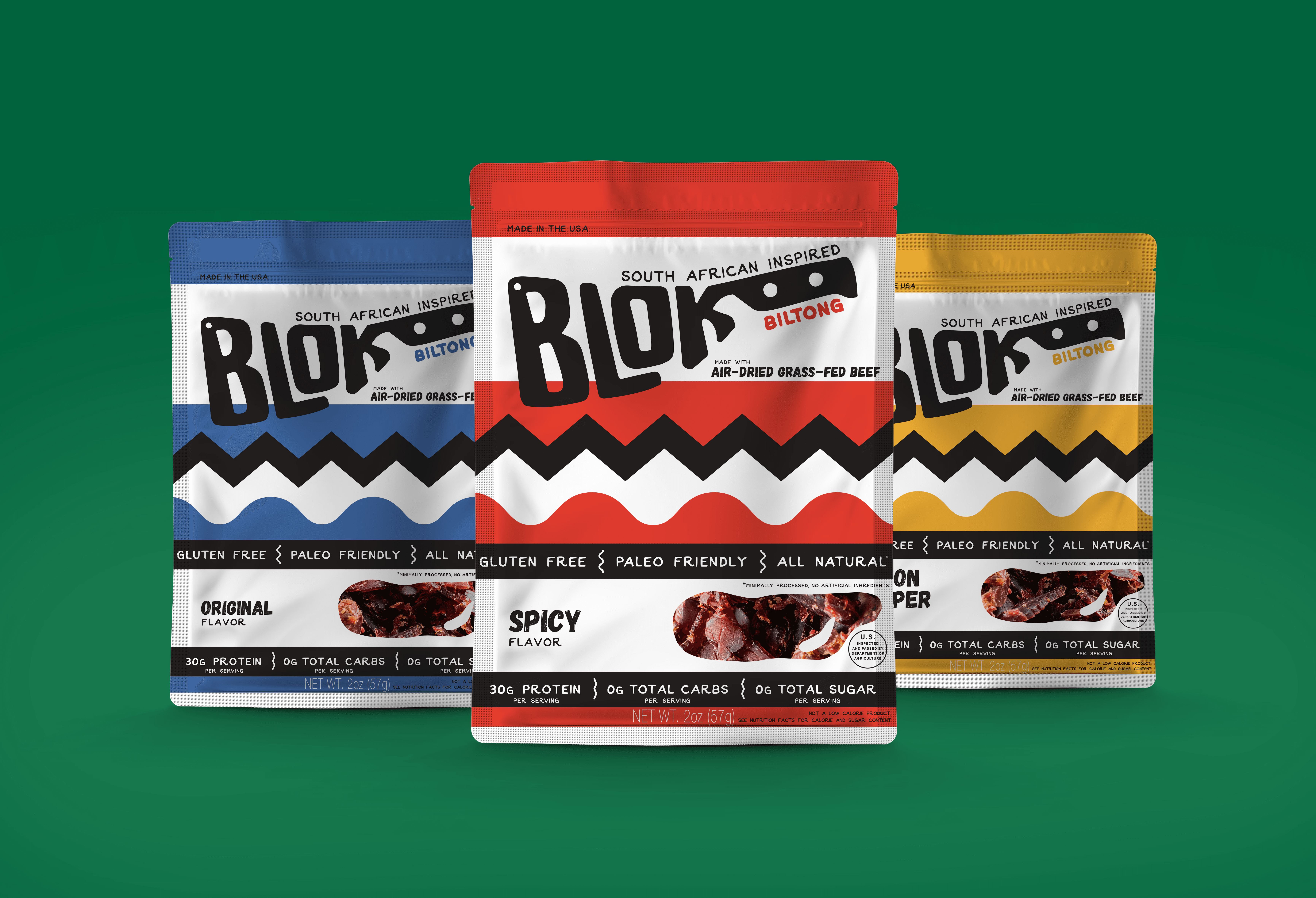
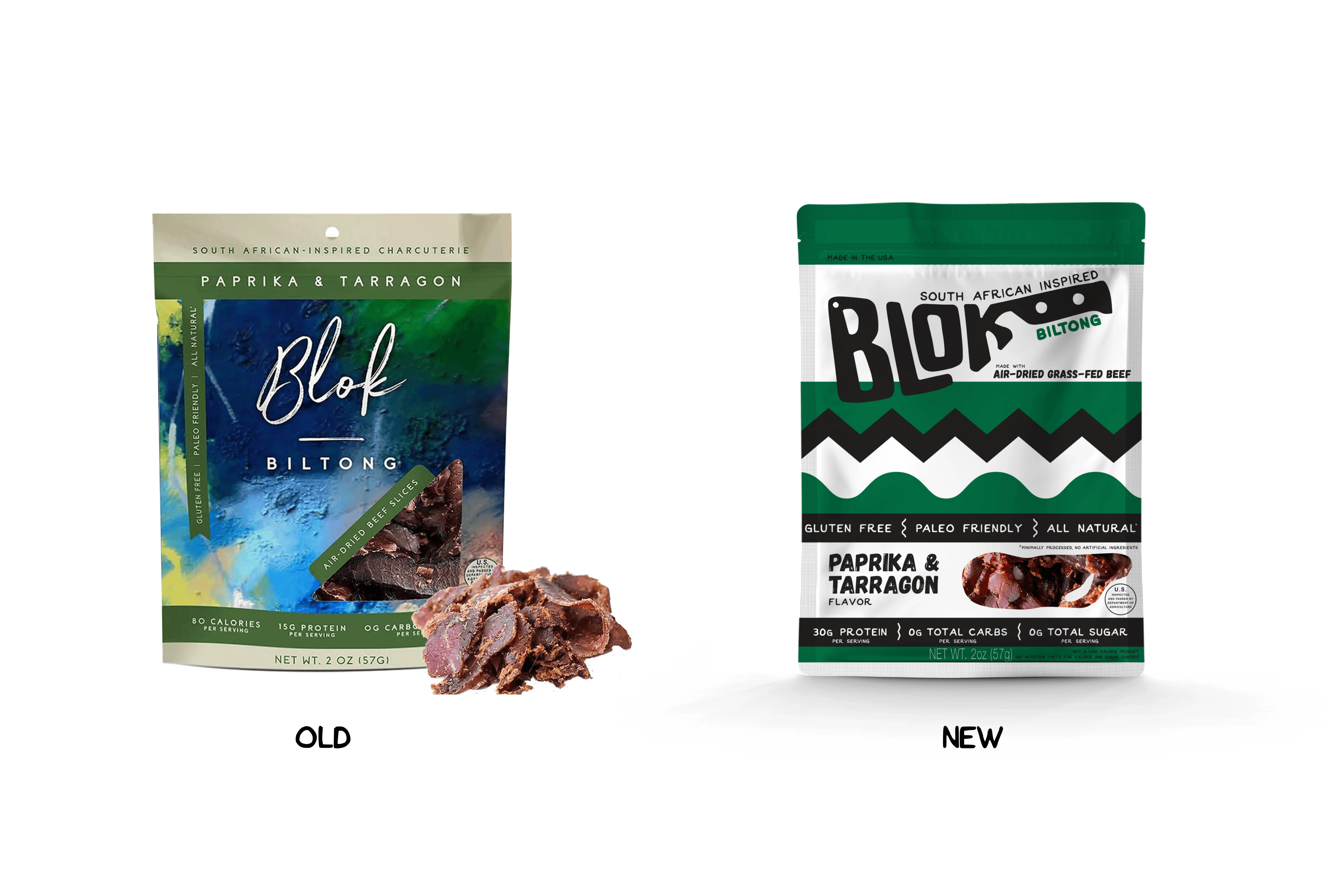
We kept the nod to biltong’s South African origins – using colors from the South African flag and designs that fresh and clean, but still handcrafted. A logo rework completed the feel, referencing a big knife traditionally used to chip slices of biltong right off the blo(c)k.